Measure Contrast from Real Pixels with Two Screenshots

A contrast ratio calculated from two CSS colors only tells you anything when the background is a single flat color. Once the background is frosted glass over a photo, that number is just an assumption. The most direct approach is to measure the pixels the browser actually draws.
1-minute summary
- Symptom / problem
- A contrast checker that reads colours from CSS fails on frosted glass, gradients and photos.
- Who should read
- Web developers who must measure contrast over non-flat backgrounds.
- Fix in short
- Capture the page twice with text made transparent in the second pass, find glyph pixels from the difference, measure contrast on real pixels, and fix with colour tokens that flip in dark mode.
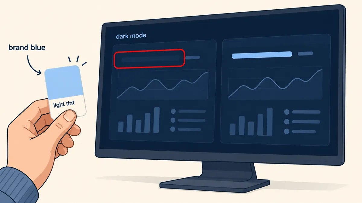
I was working on a glass-style website mockup: frosted glass panels over photos and gradients, with both light and dark themes. A contrast checker that read color and background-color from CSS reported that almost everything passed. But when I opened dark mode and looked at it myself, I found brand-blue text on a navy background that was barely visible, and white cards with text so faint I had to strain to read it. The checker said it passed; my eyes said it was unreadable. I trusted my eyes and wrote a new tool that measures the actual rendered pixels instead.
I am leaving out the real project and file names. The example brand color, #1d6fd8, is made up, and I rewrote the code in a shorter form to show the core method rather than copying entire files here.
Why reading CSS values does not work for glass and photos
A CSS-only checker does two things: it reads the text color, then walks up to the first ancestor element with a background-color and uses that as the background. It then calculates the luminance ratio using the WCAG formula. This works when the background is an opaque color, but it breaks in three situations.
- Frosted glass: the card background is
rgba(255,255,255,.3)layered over an image. The color you see is the blend of the card and whatever is behind it, which CSS does not know. - Gradients: a single line of text can start on a light area and end on a dark one. A single average value does not work.
- Photos: the brightness behind the text changes with every pixel. CSS has none of this information.
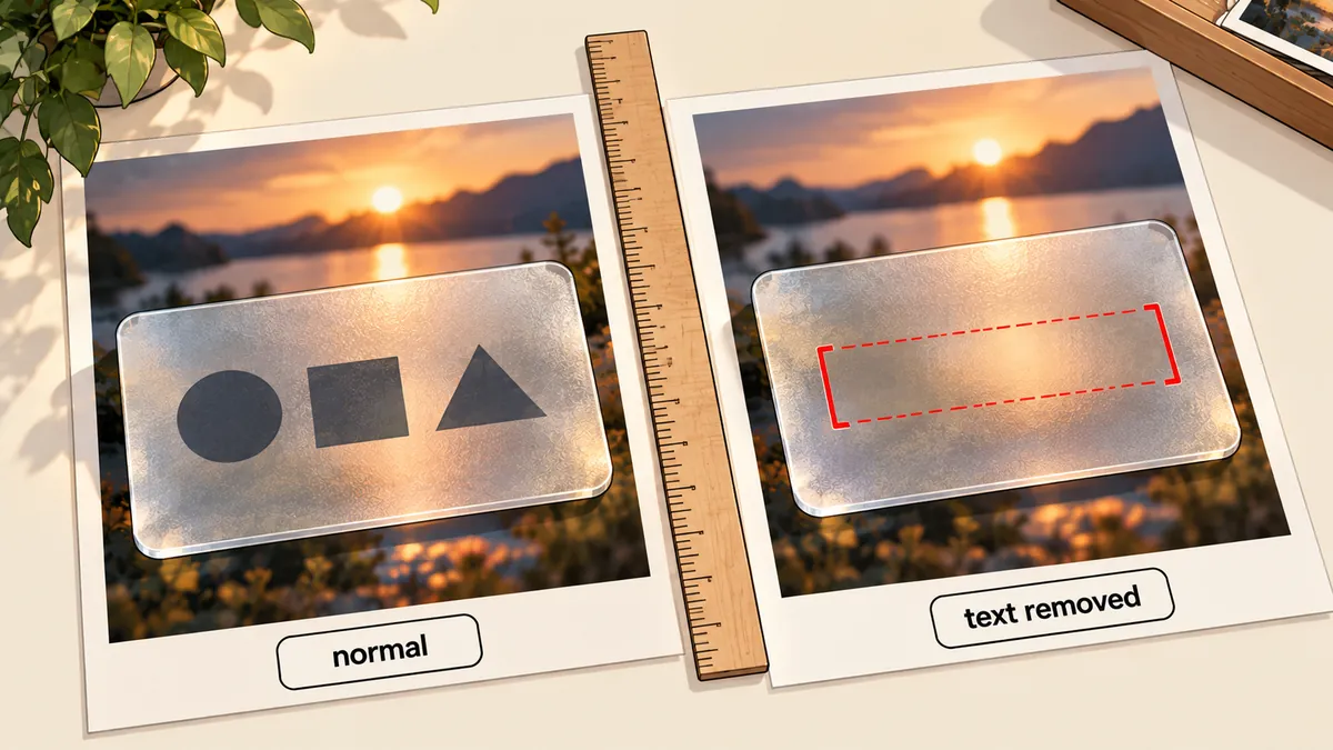
That last point is what I wanted. If I could put an image of "just the background" beside the normal image, I could find the color behind each character.
The idea: take two screenshots, with transparent text in the second
The principle is simple. Capture the page twice without moving anything. Capture A is the normal page. For capture B, inject CSS that makes all text transparent. The layout stays the same because color: transparent does not affect box dimensions. Image B therefore contains the entire actual background. Then subtract the two images. The pixels that differ belong to the glyphs, and the color at the same pixel in image B is the actual background behind that glyph.
The script, step by step
I use Playwright with an installed Chromium, running on Node, in these seven steps. Each step has a reason I learned firsthand; none is there just for the sake of it.
- Load the page, then scroll through the whole page so all lazy-loaded images load. Otherwise, the captured background will contain empty boxes instead of images.
- Set the viewport height to the page height (capped at 16000 px), because a fullPage capture causes a relayout, leaving the measured box coordinates out of alignment with the captured pixels.
- Hide elements with
position: fixed. Floating chat or edit buttons will cover the bottom of the page when the viewport is as tall as the page. - Collect elements that have their own text nodes, skipping those that are hidden, have near-zero opacity, or are smaller than 2 px, along with their text color, size, weight and box.
- Capture image A.
- Inject CSS to make the text transparent, then capture image B.
- Calculate the result for each element, then print
[OK]or[FAIL] nalong with the worst rows.
Here is the shortened code, which I have run against a small test page. The only installation needed is npm i playwright pngjs.
// audit.cjs - วัด contrast จากพิกเซลที่ render จริง (ฉบับย่อ)
const { chromium } = require('playwright');
const { PNG } = require('pngjs');

const lin = c => { c /= 255; return c <= 0.03928 ? c / 12.92 : ((c + 0.055) / 1.055) ** 2.4; };
const lum = ([r, g, b]) => 0.2126 * lin(r) + 0.7152 * lin(g) + 0.0722 * lin(b);
const ratio = (a, b) => (Math.max(a, b) + 0.05) / (Math.min(a, b) + 0.05);
const pct = (arr, p) => arr[Math.min(arr.length - 1, Math.floor(arr.length * p))];

async function audit(url, scheme, width) {
  const b = await chromium.launch();
  const page = await b.newPage({ viewport: { width, height: 900 }, colorScheme: scheme });
  await page.goto(url, { waitUntil: 'networkidle' });

  // 1) เลื่อนให้รูป lazy โหลด แล้วขยาย viewport เท่าความสูงหน้า (กัน fullPage relayout)
  await page.evaluate(async () => {
    for (let y = 0; y < document.body.scrollHeight; y += 600) {
      scrollTo(0, y); await new Promise(r => setTimeout(r, 80));
    }
    scrollTo(0, 0);
  });
  const h = Math.min(16000, await page.evaluate(() => document.documentElement.scrollHeight));
  await page.setViewportSize({ width, height: h });

  // 2) ซ่อน fixed แล้วเก็บ element ที่มี text node ของตัวเอง
  const items = await page.evaluate(() => {
    for (const el of document.querySelectorAll('body *'))
      if (getComputedStyle(el).position === 'fixed') el.style.visibility = 'hidden';
    const out = [];
    for (const el of document.querySelectorAll('body *')) {
      const cs = getComputedStyle(el);
      if (cs.visibility === 'hidden' || cs.display === 'none' || +cs.opacity < 0.05) continue;
      if (![...el.childNodes].some(n => n.nodeType === 3 && n.textContent.trim())) continue;
      const r = el.getBoundingClientRect();
      if (r.width < 2 || r.height < 2) continue;
      out.push({ tag: el.tagName.toLowerCase(), text: el.textContent.trim().slice(0, 30),
        color: cs.color, size: parseFloat(cs.fontSize), weight: +cs.fontWeight,
        x: Math.round(r.left), y: Math.round(r.top + scrollY),
        w: Math.round(r.width), h: Math.round(r.height) });
    }
    return out;
  });

  // 3) รอบ A = ปกติ, รอบ B = ตัวอักษรโปร่งใส เหลือแต่พื้นหลังจริง
  const A = PNG.sync.read(await page.screenshot());
  await page.addStyleTag({ content: '*{color:transparent!important;-webkit-text-stroke-color:transparent!important;text-shadow:none!important;caret-color:transparent!important}' });
  const B = PNG.sync.read(await page.screenshot());
  await b.close();
  return { items, A, B };
}
The second half does the calculations, which are the heart of this method. I put them in their own function.
// ต่อจาก audit.cjs - คำนวณต่อ element
function score({ items, A, B }) {
  const fails = [];
  for (const it of items) {
    const m = it.color.match(/[\d.]+/g).map(Number);
    const fg = m.slice(0, 3), alpha = m.length > 3 ? m[3] : 1;

    // พิกเซลของ glyph = จุดที่ A ต่างจาก B (ผลรวมต่าง RGB >= 60)
    // สีพื้นหลัง = ค่าของ B ที่จุดเหล่านั้น (ขอบมนและ padding เลยไม่ถูกนับเป็นพื้นหลัง)
    const bg = [];
    for (let y = Math.max(0, it.y); y < Math.min(A.height, it.y + it.h); y++)
      for (let x = Math.max(0, it.x); x < Math.min(A.width, it.x + it.w); x++) {
        const i = (y * A.width + x) * 4;
        const d = Math.abs(A.data[i] - B.data[i]) + Math.abs(A.data[i + 1] - B.data[i + 1])
                + Math.abs(A.data[i + 2] - B.data[i + 2]);
        if (d >= 60) bg.push([B.data[i], B.data[i + 1], B.data[i + 2]]);
      }
    if (bg.length < 12) continue;       // glyph น้อยไป (ฉบับเต็มถอยไปใช้ทั้งกล่อง)

    // สีตัวอักษรที่มี alpha ถูกผสมกับค่าเฉลี่ยของพื้นหลัง
    const avg = [0, 1, 2].map(k => bg.reduce((s, p) => s + p[k], 0) / bg.length);
    const mixed = fg.map((c, k) => c * alpha + avg[k] * (1 - alpha));
    const L = lum(mixed);

    // เทียบกับ percentile ที่ 5 และ 95 ของความสว่างพื้นหลัง เอาตัวที่แย่กว่า
    const ls = bg.map(lum).sort((a, b) => a - b);
    const worst = Math.min(ratio(L, pct(ls, 0.05)), ratio(L, pct(ls, 0.95)));

    const large = it.size >= 24 || (it.size >= 18.66 && it.weight >= 700);
    const need = large ? 3 : 4.5;
    if (worst < need) fails.push({ ...it, worst: +worst.toFixed(2), need });
  }
  return fails;
}
I use percentiles 5 and 95 instead of the average because a photo background contains both light and dark areas within the same box. With an average, text that blends into the background across half its area could slip through. Comparing against both ends and taking the worse result amounts to asking, "At the worst spot where the text sits, is it readable?"
Normal text needs 4.5:1. Large text (at least 24 px, or at least 18.66 px if bold) uses 3:1, and icon fonts use 3:1. I run at both 1440 and 390 widths in both light and dark modes through Playwright's colorScheme, because my actual problem only appeared in dark mode.
Try a small test page before trusting it
Before using it on real work, I built a small test page with a blue-to-white gradient background and a translucent card over it. Inside were one line of white text and one line of black text. Then I ran the script above. The black text passed in every mode. The white text on the translucent card failed in every run.
$ node audit.cjs file:///path/to/test.html
[FAIL] light 1440px - 1 element
   2.49:1 (ต้อง 4.5)  <p> "white on glass"
[FAIL] light 390px - 1 element
   1.7:1 (ต้อง 4.5)  <p> "white on glass"
[FAIL] dark 1440px - 1 element
   2.49:1 (ต้อง 4.5)  <p> "white on glass"
[FAIL] dark 390px - 1 element
   1.7:1 (ต้อง 4.5)  <p> "white on glass"
These numbers come only from the test page I built, not from an audit of any project. But they show what I wanted to see: white on the brand blue should pass according to the formula (about 4.9:1), but on a translucent card over the white end of a gradient, the text ends up on a much lighter area. The two screen widths also produce different numbers because the gradient stretches differently. A checker that reads CSS values has no way to see this difference.
The script does not measure text from ::before or ::after (such as step numbers inserted through content); those need visual inspection. For text over video or a canvas that can move, the result only represents the instant of capture. I have not measured how long the script takes on long pages, so I will not give a number.
How to read the FAIL list
When the [FAIL] list is long, fixing entries in the order they are printed wastes effort. I sort by the worst ratio first, then look for patterns among those worst rows: the same class, the same section, or the same brand color used for text. A shared pattern means the cause lies in a single token or component. Fix it there once, and the remaining rows clear up together. What I do not do is open DevTools and change colors one element at a time, because that fixes things without teaching me anything. The script also prints each element's tag and a short text snippet so I can spot those patterns quickly.
Use tokens that switch with the mode instead of fixing each spot
Once I had the [FAIL] list, the temptation was to change the color of each element. I tried that, and it did not work. I would fix one spot so it passed in light mode, only for it to break in dark mode, and a new card the next day would have the same problem. What worked was changing how I thought about color: using semantic tokens that know which mode they are in.
:root {
  --brand: #1d6fd8;                       /* สีแบรนด์ ใช้กับพื้น/เส้น/ปุ่มทึบเท่านั้น */
  --brand-text: #1d6fd8;                  /* สีแบรนด์เมื่อใช้เป็นตัวอักษรหรือไอคอน */
  --surface-2: rgba(255, 255, 255, .72);  /* การ์ดย่อยบนกระจก */
  --tint: rgba(29, 111, 216, .10);        /* พื้นของชิป/ปุ่ม ghost */
  --tint-border: rgba(29, 111, 216, .35);
  --ok: #17703f;                          /* ไอคอนสถานะสำเร็จ เข้มขึ้นในโหมดสว่าง */
}
@media (prefers-color-scheme: dark) {
  :root {
    --brand-text: #a9cbf6;                /* tint อ่อน แทนสีแบรนด์ตรง ๆ */
    --surface-2: rgba(255, 255, 255, .07);
    --tint: rgba(169, 203, 246, .12);
    --tint-border: rgba(169, 203, 246, .35);
    --ok: #86d9ad;                        /* อ่อนลงในโหมดมืด */
  }
}

.link, .icon-accent { color: var(--brand-text); }     /* ไม่ใช้ var(--brand) เป็นตัวอักษร */
.card-inner         { background: var(--surface-2); } /* ไม่ใช้ #fff ตายตัว */
.chip, .btn-ghost   { background: var(--tint); border: 1px solid var(--tint-border); color: var(--brand-text); }
Here is how the two approaches compare.
Change the color on failing elements
Passes in one mode, breaks in the other, and new cards added later break again. Every change needs another manual check. Color choices are scattered throughout the files.
Do not use the brand color directly for text
Text and icons use --brand-text, secondary cards use --surface-2, and chips use --tint. All switch with the mode. Change one place, and the whole site follows.
Besides the tokens above, the tool caught some local issues that I fixed individually.
- Text over images: increase the opacity of the covering overlay or gradient until it passes. My CTA strip settled at about .9.
- Outline numbers using
-webkit-text-strokefailed on dark backgrounds. I added a fill with--brand-textso they had actual solid color. - Dropdowns in a blurred menu bar: the background showed through the dropdown text. I fixed this by moving the nav blur to the nav's
::beforeinstead.
/* ก่อน: เบลอที่ nav โดยตรง dropdown ที่ซ้อนอยู่ข้างในเบลอพื้นหลังไม่ได้ ตัวอักษรทะลุ */
/* .nav { backdrop-filter: blur(14px); } */

/* หลัง: ให้ ::before เป็นตัวเบลอ nav เองไม่มี backdrop-filter */
.nav { position: sticky; top: 0; }
.nav::before {
  content: ""; position: absolute; inset: 0; z-index: -1;
  backdrop-filter: blur(14px);
}
For the dropdown issue, all I know is that moving it made the problem go away. I have not proved the browser mechanism that prevents nested backdrop-filter layers from seeing the original background in this article.
The cycle I use every time
My actual sequence is to run the script across four combinations (light and dark, multiplied by 1440 and 390), review the [FAIL] list from worst to best, fix the tokens rather than individual elements, and rerun until all four combinations return [OK]. Finally, I open cropped dark-mode images of the areas I had previously identified by eye as unreadable and look at them again myself. A measuring tool can tell me where the noise is coming from, but it cannot make every judgment for my eyes, especially for ::before content that the script cannot see.
Personally, when a page has frosted glass or an image background, I no longer trust checkers that only read CSS values. Feel free to take the shortened script above and adjust the thresholds or percentiles to suit your work. I will come back and make further changes later.
Hit something like this? Stuck somewhere?
Come trade notes on the LinuxThai board



Comments 0
No comments yet — be the first